tombstone.
Case Study: design strategy, identity, packaging system & standards.
about
Founded in 1962 at the Tombstone Tap in Medford, WI—a bar located across the street from a cemetery. The pizza brand was bought by Nestlé as part of a $3.7 Billion acquisition.
creative team
In-House Strategic Design: Tom Davie
Design Studio: Chase Design Group
Brand Identity Lettering: Lux Typo.
Product Photography: Wright Studio

photo © Chase Design Group
business & brand impact
Post-redesign, Quarter over Quarter sales growth in the back half of 2024 into 2025. Launched an aligned ‘Born in a Bar’ brand positioning and packaging system with consumer-relevant brand world assets and standards for omnichannel activations.
brand identity
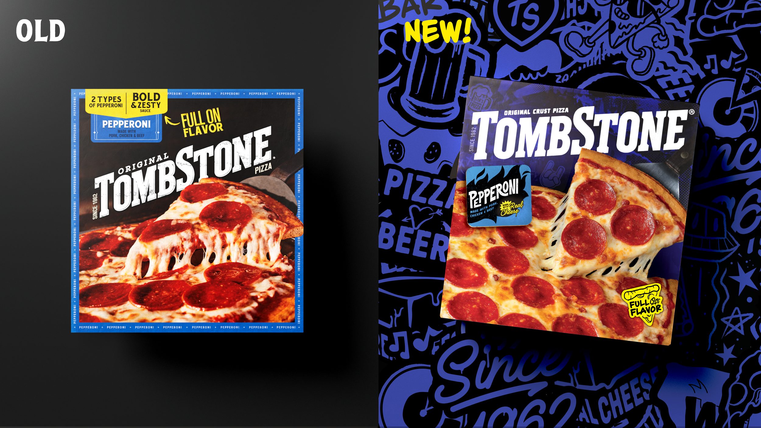
The angled wordmark has a high-level of recall among consumers—being one of the most effective in the pizza category. Because of the love for the existing identity, we took care in refining without alienating. The letterforms were optimized for legibility and spacing, the angle was adjusted for maximum scalability and the texture was simplified from the previous granite veining approach. The essence was retained with results that move the brand forward.

photo © Chase Design Group
packaging
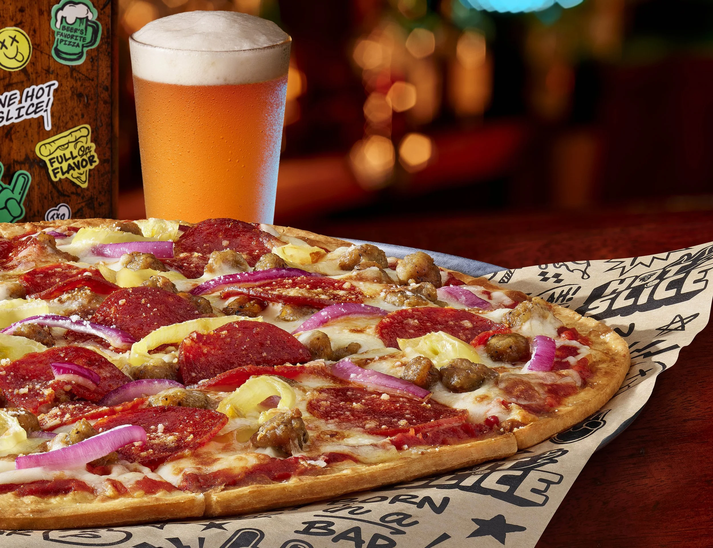
The packaging redesign embraced the Born in a Bar positioning by evoking the local pub experience. From pints of beer, to coasters and stickers, to the smell of pizza and hanging with friends—we unlocked the feelings of being at your neighborhood tavern. The redesign consisted of three segments: Original line cartons, Original line overwraps and Tavern Style cartons, with the style being adapted to offerings such as pizza stix. The updated packaging has shown quarter over quarter growth in market and has been featured by The Dieline.

photo © Chase Design Group

photo © Chase Design Group

photo © Wright Studio
brand standard
As part of the brand redesign, an updated brand standard was created. The standard includes core documents such as consumer portraits, brand purpose and essence, brand properties and product portfolio. The standard has dual purpose of on-boarding new agency partners and brand team members, while also establishing visual and comms tone and personality for omnichannel work.

© Nestlé USA

© Nestlé USA
photography
There were three photography challenges that had to be solved. A highly-complex packaging shoot for the new Tavern Style subline, Re-imaging the Original ‘core’ portfolio and capture, and bring the brand to life … lifestyle assets shot in Chicago taverns
consumer insights & testing
Conducted as a MetrixLab Quantitative test over a 10-day period that included both category and brand consumers. The winning design system showed significant improvement from Current packaging at 90% Confidence Interval on all KPI categories, including (Visibility, Communication & Persuasion) with no disadvantages to Current.